2024

[ The project was carried out during my time at Marketing01.
Due to company policy I cannot go into the details of the study of the different phases. ]

#859DAD
#6781A0
#63BA5A
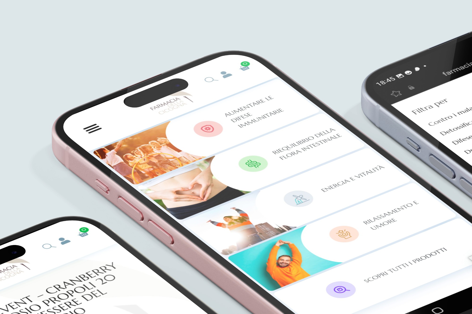
The e-commerce for this customer was realised in WordPress (Woocommerce). The first reason was that the customer was already familiar with the platform, so he immediately became autonomous in managing the warehouse and orders.
Below are the main reasons behind the choice.
Woocommerce is very easy to use if you only have a few products to manage.
The customer was already familiar with the platform and immediately became autonomous in managing the warehouse and orders.


The product page is simple in its navigation, even from mobile.
When scrolling, a fixed CTA appears to purchase the product.
The benefits and composition of the product are immediately listed to emphasise its quality.

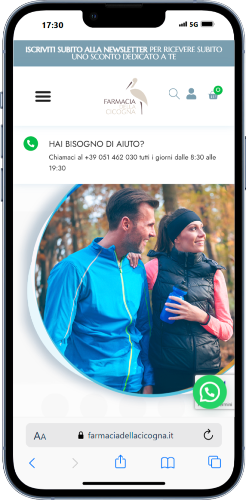
Given the average age of the person, it was decided to insert a call to action immediately below the header to request professional advice in choosing a product.


Browse the site, it’s still online!
Tatiana Grossi
Web Designer | UX/UI Designer | Graphic Designer